A screenshot alone is not automatically a strong presentation
Many creators publish raw screenshots from a website, app, or game and assume that this is enough for a portfolio. In reality, a simple screenshot only documents a screen. It does not automatically create a clear, coherent, or memorable presentation.
If you want a project to feel well positioned in your portfolio, you need to treat images as part of the project's narrative, not just as proof that the product exists.
The purpose of the image is to guide attention
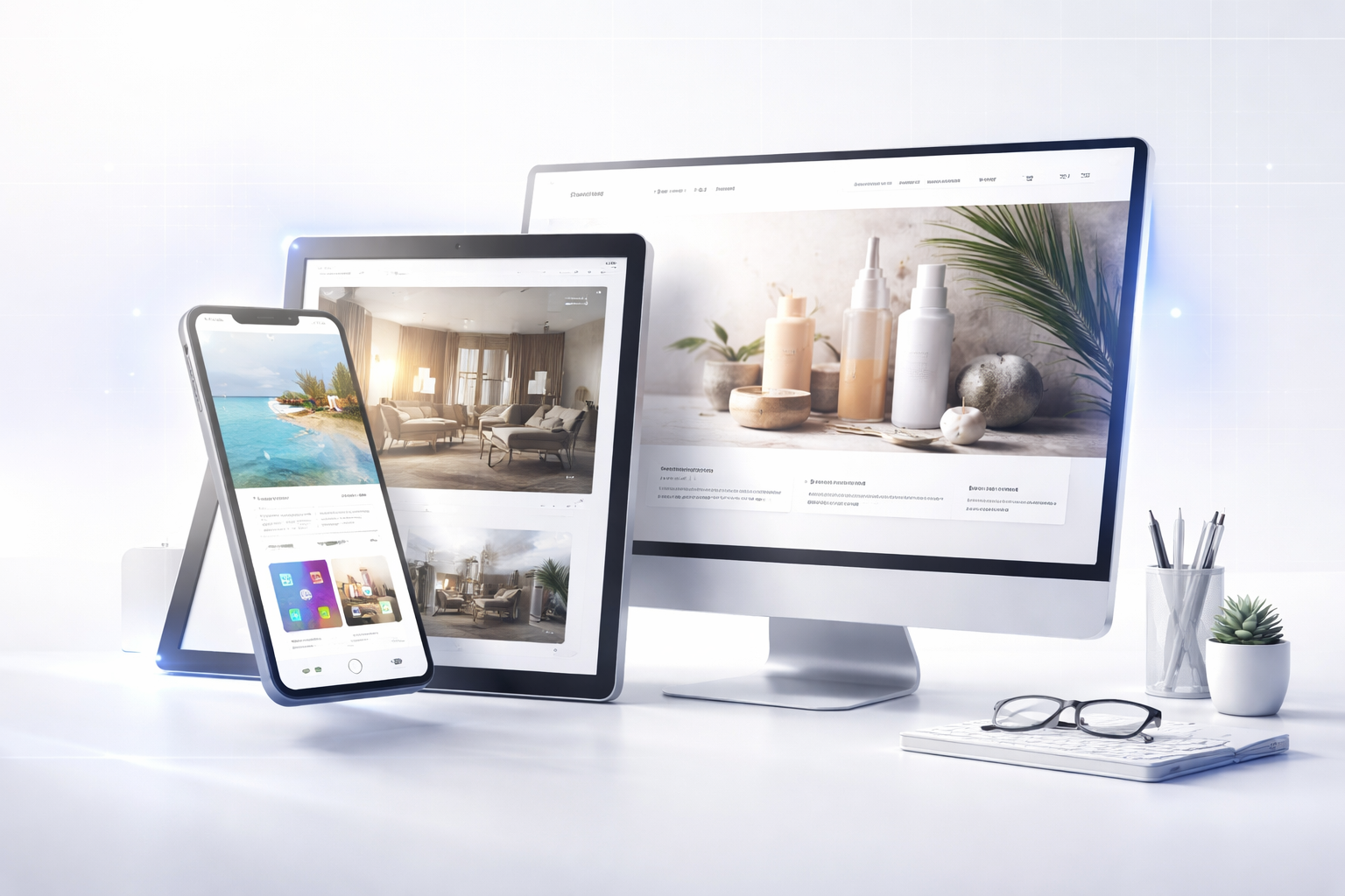
A strong portfolio image does not need to show everything. It needs to show what matters most. That means frame selection is more important than the number of screenshots you publish.
- Which screen best communicates the type of project
- Which part of the interface explains the main value
- Which image works best as a cover
- Which screenshots belong inside the page as supporting detail
Not every good screen inside the product is also a good screen for presentation.
Raw screenshot versus presentation image
A raw screenshot can be useful for documentation or internal sharing, but in a portfolio it often feels flat. Browser chrome, irrelevant UI fragments, system bars, or weak composition can make the project look less refined than it actually is.
A better presentation image usually means:
- More careful cropping
- A subtle mockup when it helps provide context
- Removing distracting elements
- A clear order between cover image, detail images, and support images
- A shorter but stronger image selection
The first image has a special role
In most cases, the first image in a project or article is the one that stops the scroll and sets the tone. It should be the clearest, most stable, and most representative image of the project.
For a website, that may be a strong homepage section. For an app, it may be a well-balanced main screen. For a game, it may be a moment that quickly communicates style and atmosphere.
The order of images tells a story
A good portfolio does not just show images. It builds progression. After the cover image, the next visuals should go deeper into the project and explain what makes it valuable.
- First image: overall impression and identity
- Second image: important flow or functionality
- Third image: detail, mobile view, or supporting screen
Even three well-chosen images can say more than ten screenshots presented without structure.
Presentation matters even more when there is no public demo
In some cases, a project cannot be explored publicly in depth. That makes visuals even more important. They need to compensate for the lack of direct access and communicate the clarity, quality, and nature of the project.
This is especially relevant for private applications, concepts, or projects shown mainly through case studies.
Conclusion
A simple screenshot shows what exists. A stronger presentation shows what deserves attention. The difference comes from selection, composition, and the order in which images are used. In a portfolio, images are not decoration. They are an essential part of how the project is understood.